Burger Hut

BurgerIM became known as one of the largest scams in the franchise business. They got a lot of attention from the media and had famous people like reality TV star Jonathan Cheban and food blogger Koko endorsing them. Their pictures and support were shown in all BurgerIM stores, and they were talked about in popular news sources as one of the most popular and fastest-growing brands in the industry.
01. The Challenge
After the founder of BurgerIM, Oren Loni, left the country, the company closed down, leaving behind employees who didn’t get paid and franchise owners who went bankrupt. Some franchise owners tried to survive by changing the menu, how they served customers, and even changing the name of their store. But without a marketing expert, it was hard for them to be successful. One of these franchise owners was BurgerIM in Wylie, Texas. They hired us to rebrand their store as Burger Hut.
- Rebuild Trust: One of our goals was to rebuild the trust of customers and attract new ones with the new brand.
- New Visual Identity: We needed to come up with a new name, logo, and overall look for the store. We also had to figure out who would be interested in the new brand and make sure we reached out to them.
02. The Solution
As marketing experts, we started by carefully studying the BurgerIM brand to see what was good about it and what needed improvement. We found an exciting opportunity near the Burger Hut Wylie franchise – Wylie High School. Many students from the school had not yet tried Burger Hut, so we wanted to appeal to them. We created a brand language that would connect with this group of young people.
To make Burger Hut stand out and be easily recognizable, we made a special logo using the golden ratio. This made sure it looked different from ordinary images and shapes. The logo was designed to be bold so that people could see it clearly even on small screens or from far away. We added a playful touch by making a heart-shaped bite mark on the burger patty, showing that eating at Burger Hut is all about love and enjoyment. The letters in the logo were big and friendly, perfect for teenagers. We chose colors like yellow, black, and red that catch people’s attention and are easy to remember.
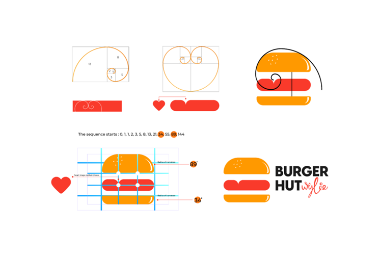
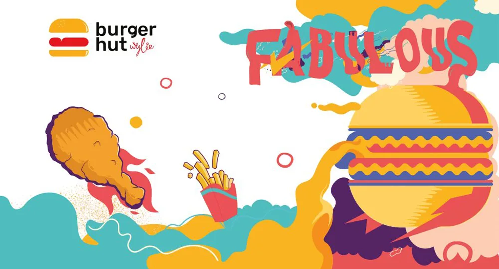
As part of our branding work, we created a special Burger Hut brand mural inspired by street graffiti art. We chose this style because it connects well with our main audience, which is high school students. The graffiti art makes Burger Hut more relatable to these students, helping us form a stronger connection with them. This not only makes our brand more memorable but also gives our customers a unique experience that makes us different from other places.
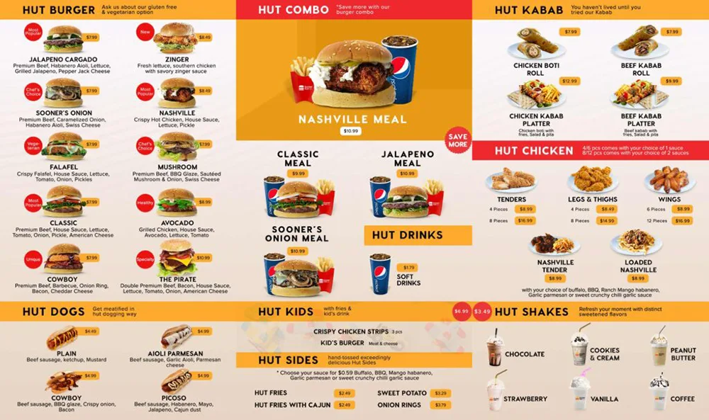
To make the Burger Hut menu even better, we used a tool called the BCG Matrix. This helped us identify the most popular and successful menu items. We found that the Nashville Chicken Burger and Jalapeno Beef Burger were the most popular, and the new Cowboy Beef Burger was also becoming popular. We saw potential in the Avocado Burger, so we made it a healthier option by removing Swiss cheese. The Wings, Fries, and Leg menu items were considered successful and brought in a good amount of money, especially for students on a budget. These items were marked as our “cash cows.” However, the Hotdogs didn’t sell well, so we decided to remove them from the menu. They were marked as our “dogs” because they didn’t bring in many customers.
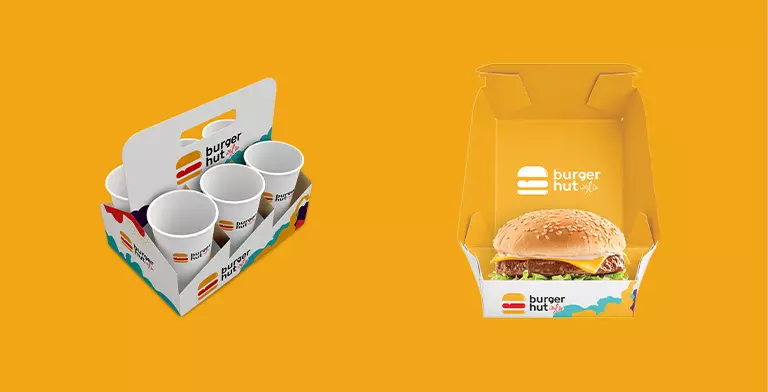
We noticed that there was a group of Muslim customers looking for halal dining options, especially when it came to burgers. So, we introduced a special menu with halal burgers and combos at discounted prices. This attracted more customers and increased the overall profit for the Burger Hut franchise.
As a digital marketing expert, we understood the importance of having a strong online presence for Burger Hut. First, we created a Google My Business listing for Burger Hut. This helped the business show up in local search results and provided important information like opening hours and contact details to potential customers.
Then, we made Facebook and Instagram pages for Burger Hut. These pages allowed the business to connect with its target audience on social media. We came up with a plan to share interesting content, such as delicious food pictures, customer reviews, and special promotions. We also ran ads on these platforms to make more people aware of the Burger Hut brand and encourage them to visit the restaurant.
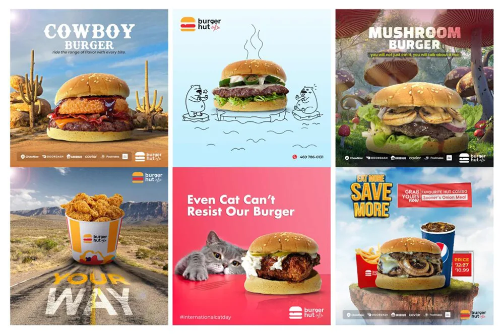
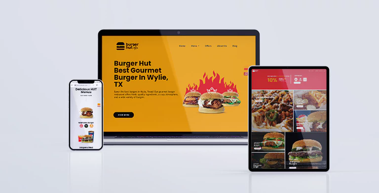
To make sure that Burger Hut’s website looked and worked well, we used a design tool called Figma. We created the website’s design, keeping in mind the brand’s special style and appearance. This included choosing colors, fonts, and pictures that matched the restaurant’s personality and beliefs. We also organized the website’s content in a way that made it easy for people to use and find what they needed.
03. The Result
By using smart and interesting digital marketing strategies, we helped Burger Hut become popular online. This brought in new customers and made existing ones keep coming back. This ultimately led to increased brand recognition and revenue for the business.